Leveraging Urgency With a Countdown Timer for Email
Understanding the Psychological Impact of Timers
In today’s busy world, getting someone’s attention in their inbox is tough. People scroll fast and delete even faster. A countdown timer in an email taps into basic human psychology. It makes a deadline feel real and immediate, pushing people to act instead of putting it off. This visual cue can make a big difference.
The fear of missing out (FOMO) is a powerful motivator. When subscribers see time ticking away, they feel a stronger urge to complete a purchase or sign up. This is especially true for limited-time offers. A countdown timer makes that offer feel exclusive and more desirable.
A countdown timer transforms a static offer into a dynamic, time-sensitive event, compelling immediate engagement.
How Countdown Timers Drive Immediate Action
When you have a flash sale or a limited-time promotion, a countdown timer is your best friend. It creates a sense of urgency that directly encourages immediate action. Instead of thinking, “I’ll check that out later,” subscribers see the clock ticking and realize “now or never.”
This visual pressure can significantly boost conversion rates. It helps reduce procrastination by presenting a clear, unavoidable deadline. For marketers, this means more sales and fewer abandoned carts. The countdown timer is a simple yet effective tool for this.
- Increased open rates: Time-sensitive subject lines grab attention.
- Higher click-through rates (CTR): Recipients engage more when time is short.
- Faster purchase decisions: The ticking clock encourages completion.
Reducing Procrastination Through Visual Deadlines
Procrastination is a common hurdle in email marketing. Subscribers often intend to act on an offer but get distracted or simply forget. A countdown timer acts as a constant, visual reminder of the approaching deadline. This makes the offer feel more pressing.
By showing time literally running out, these timers help overcome the “I’ll do it later” mindset. They make the consequence of delay—missing the offer—very clear. This visual urgency is key to getting people to click through and convert right away. Using a countdown timer effectively means making that deadline feel important.
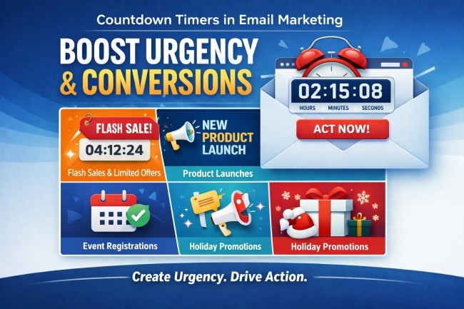
Ideal Scenarios for Implementing Email Countdown Timers
Flash Sales and Limited-Time Offers
When you’re running a flash sale, every second counts. A countdown timer in your email makes this crystal clear. It tells subscribers exactly how much time they have left to snag that amazing deal. This visual cue is powerful for driving immediate purchases. It turns a good offer into a must-act-now situation.
- Weekend flash sales
- Daily deal promotions
- Last-chance clearance events
Product Launches and Early Bird Pricing
Launching a new product? A countdown timer builds anticipation. It lets people know when they can get their hands on it. Offering early bird pricing? The timer creates urgency for those who want the best deal. This helps generate buzz and secure initial sales quickly. A well-placed countdown timer can make all the difference.
The key is to make the deadline feel real and important to your audience.
Event Registration and Webinar Sign-ups
For events like webinars, workshops, or conferences, registration deadlines are common. A countdown timer in your email campaign can significantly boost sign-ups. It reminds potential attendees that spots are limited or that the event is approaching fast. This encourages prompt registration before it’s too late. It’s a simple way to fill those seats.
- Webinar registration closing soon
- Conference early bird ticket deadline
- Workshop enrollment period ending
Holiday Campaigns and Seasonal Promotions
Holidays are prime time for sales, and a countdown timer fits right in. Think Black Friday, Cyber Monday, or even Valentine’s Day. A timer adds excitement and a sense of occasion to your seasonal promotions. It encourages shoppers to buy gifts or take advantage of holiday deals before they disappear. This makes your holiday email marketing more effective.
Strategic Placement and Design of Your Timer
Positioning the Timer Above the Fold
When you add a countdown timer to an email, its placement is super important. Think about where people look first when they open an email. Usually, that’s the top part, right? Putting your countdown timer above the fold means it’s one of the first things a subscriber sees. This immediately grabs their attention and lets them know there’s a time limit on whatever you’re offering. It’s like putting a sign right at the entrance of a store saying “Sale Ends Soon!”
This isn’t just about being seen; it’s about making an impact. A timer that’s buried deep in the email might get missed entirely, especially if the subscriber is just skimming. For flash sales or limited-time offers, this immediate visibility is key. It helps create that initial spark of urgency. The goal is to make the countdown timer a focal point, not an afterthought. It should work with your message, not against it.
The most effective timers are those that are immediately obvious and relevant. If your offer is good, a well-placed timer can really push people to act fast. It’s about making the urgency clear from the get-go, so subscribers don’t have to hunt for it. This initial placement sets the tone for the rest of the email.
Ensuring Clarity and Brand Consistency
Beyond just where you put the timer, how it looks and what it says matters a lot. Your countdown timer needs to be easy to read at a glance. This means using clear, large numbers and good contrast. If it blends into the background or is too small, people won’t be able to tell how much time is left. This defeats the whole purpose of using a timer to create urgency.
It’s also vital that the timer fits with your brand’s look and feel. While you want it to stand out, it shouldn’t look out of place. Use colors that complement your brand palette, but make sure they still provide enough contrast for readability. Think about the overall design of your email. Does the timer look like it belongs there? This consistency builds trust and makes the email feel more professional.
A timer that’s hard to read or clashes with your brand can actually hurt your campaign. It might confuse subscribers or make them question the legitimacy of the offer. Keep it simple, clear, and on-brand.
Optimizing for Mobile and Dark Mode Viewing
Most people check their email on their phones these days, so making sure your countdown timer looks good on mobile is non-negotiable. A timer that’s too big or too small on a small screen can be a real problem. It needs to be responsive, meaning it adjusts its size and layout automatically for different devices. Test it on various screen sizes to be sure.
Then there’s dark mode. More and more people are using dark mode on their devices, and emails need to look good in both light and dark settings. A timer that’s designed for a light background might become unreadable when viewed in dark mode, or vice versa. You might need to use different color schemes or adjust the contrast specifically for dark mode viewing. This ensures your countdown timer remains effective no matter how your subscriber views their email.
Here are a few things to keep in mind:
- Mobile Responsiveness: Does the timer scale correctly on smaller screens?
- Contrast: Is it readable in both light and dark modes?
- Font Size: Are the numbers large enough to see easily on any device?
- Loading Speed: Does the timer load quickly without slowing down the email?
Technical Considerations for Countdown Timer for Email
Implementing a countdown timer for email isn’t as simple as dropping in a static image. Because most email clients block scripts, these timers aren’t live JavaScript clocks. Instead, they typically rely on dynamically generated images or animated GIFs. These elements need to update in real time to show the accurate time remaining. This means the timer’s functionality is tied to how often the email is opened and how the client handles image refreshes.
The core challenge lies in ensuring the timer displays correctly across various email clients and devices. Some clients might not refresh the image every time the email is opened, leading to a frozen timer. This is why testing in actual inboxes, not just preview tools, is so important. Specialized timer services often handle the complex image generation and updating, simplifying the process for marketers.
Beyond the visual, consider what happens after the timer expires. Dynamic links can automatically redirect users to a relevant page, like a standard product page if a discount has ended. This prevents broken links and confusing error messages, maintaining a smooth user experience even when the offer is gone. A well-integrated countdown timer for email requires attention to both its visual display and its post-expiration behavior.
Best Practices for Effective Countdown Timer Usage
Maintaining Authenticity With Real Deadlines
Using a countdown timer for email isn’t just about adding a visual element; it’s about building trust. The urgency created by a timer only works if the deadline is genuine. If a sale is advertised to end in 24 hours, it should actually end then. Stretching deadlines or resetting timers too often can make subscribers feel tricked. This erodes confidence in future campaigns. Always ensure the timer reflects a real, time-sensitive offer.
When you use a countdown timer, it should be tied to something that actually ends. Think flash sales, limited-time discounts, or early bird pricing windows. If your offer isn’t truly time-bound, like an on-demand webinar, a timer might not be the right fit. It’s better to skip it than to create a false sense of urgency. This keeps your marketing honest and your audience engaged.
The effectiveness of a countdown timer hinges on its connection to a tangible, time-limited incentive. Without a real deadline, the timer loses its power and can even backfire, damaging subscriber trust.
Pairing Timers with Clear Calls-to-Action
A countdown timer on its own isn’t enough. It needs to work hand-in-hand with a strong call-to-action (CTA). The timer creates the push, but the CTA tells people exactly what to do next. Make sure your CTA is prominent and clearly states the benefit of acting quickly. For example, “Shop the Sale Now” or “Claim Your Discount Before It’s Gone.”
Placement is key here. The timer and the CTA should be close together, ideally within the same visual block. This way, when a subscriber sees the time is running out, they can immediately click to take advantage of the offer. This proximity reduces friction and makes it easier for them to convert.
Consider the user journey. What happens after they click? Ensure the landing page reinforces the urgency and makes the purchase or sign-up process smooth. A seamless transition from seeing the timer to completing the desired action is vital for maximizing conversions.
Testing and Analyzing Timer Performance
To truly get the most out of your email countdown timers, you need to test and analyze their performance. Don’t just set it and forget it. A/B testing different timer designs, placements, and even the offers themselves can reveal what works best for your audience. Compare campaigns with timers against those without to see the impact on engagement and sales.
Track key metrics like open rates, click-through rates, and conversion rates. Are people clicking more when a timer is present? Are they completing purchases faster? This data provides insights into how well your countdown timer is driving action. Use these findings to refine your strategy for future campaigns.
Remember that what works for one audience might not work for another. Continuous analysis helps you adapt your approach. This ensures your countdown timer strategy remains effective over time and continues to support your sales goals. The goal is to make every second count.
Avoiding Common Pitfalls With Email Timers
Providing Context for Your Countdown
Sometimes, a countdown timer for email can just show numbers ticking down without any explanation. This can leave subscribers scratching their heads. It’s important to clearly state what the timer is counting down to. Is it the end of a sale, the deadline for event registration, or something else? Without this context, the urgency a countdown timer aims to create can fall flat. A simple phrase like “Sale ends in:” or “Last chance to register:” makes all the difference.
Preventing Timer Overload in Emails
While a countdown timer can be a powerful tool, using too many in a single email can actually hurt your campaign. Imagine opening an email and seeing multiple timers counting down to different things. It’s confusing and overwhelming. This overload can lead to subscribers not taking any action at all. It’s generally best to stick to one primary countdown timer per email. If you have multiple time-sensitive offers, consider sending separate, focused emails for each.
Ensuring Mobile Responsiveness
Many people check their email on their phones. If your countdown timer for email doesn’t display correctly on smaller screens, you’re missing out on potential engagement. A timer that looks jumbled or is too small to read on a mobile device is ineffective. Always test how your timer appears across different devices and email clients. This ensures that the urgency is communicated clearly, no matter how your subscribers access their inbox.
Wrapping Up: When to Hit the Gas with Timers
So, when should you actually put one of those ticking clocks in your emails? Think of them as your secret weapon for those moments when time is literally money. Flash sales, product launches with a special early price, or even just a weekend-only deal – these are prime spots. They work because they tap into that natural human feeling of wanting something before it’s gone. Just remember, honesty is key; don’t fake a deadline. Make sure the timer is visible, paired with a clear call to action, and looks good on phones. When used right, these timers can really get people to pay attention and act fast, turning a casual glance into a quick click.