7 Things Every Data Plot Needs
Data plots are essential tools for presenting complex information in a clear and accessible way. Whether used in financial dashboards, scientific research, or business analytics, effective data plots allow users to interpret trends, patterns, and insights quickly. In the realm of JavaScript Charts, creating plots that are both functional and visually appealing requires careful consideration of several key elements.
This article outlines seven critical components that every data plot should include to ensure clarity, usability, and impact. A professional at SciChart, a leading provider of high-performance charting solutions, offers the following insight: “Creating effective data visualisations demands a balance of clarity and performance, especially when handling large datasets.
Our focus on high-performance JavaScript charting ensures developers can build responsive and visually coherent plots that meet modern application demands.” This commentary underscores the importance of thoughtful design in data plotting, particularly when leveraging advanced tools to achieve optimal results.
Clear and Meaningful Axes
The foundation of any data plot lies in its axes, which provide the framework for interpreting the data. The x-axis and y-axis must be clearly labelled with units and scales that are easy to understand. For instance, a plot displaying temperature over time should specify whether the temperature is in Celsius or Fahrenheit and whether the time is in hours, days, or months.
Ambiguity in axis labels can lead to misinterpretation, undermining the plot’s purpose. Additionally, the scale of the axes should be appropriate for the data range. Linear scales are common, but logarithmic or categorical scales may be necessary for specific datasets, such as exponential growth or non-numeric categories. Ensuring that tick marks and gridlines are evenly spaced and not overly cluttered further enhances readability. A well-designed axis system guides the viewer’s eye naturally, making the data’s story immediately apparent without requiring excessive effort to decode.
Appropriate Data Representation
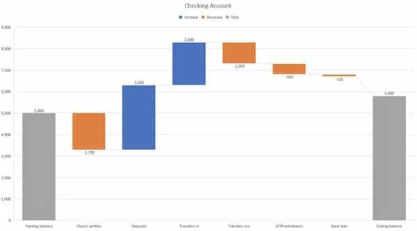
Choosing the right type of plot for the data is crucial. Line charts are ideal for showing trends over time, such as stock prices or sensor readings, while bar charts excel at comparing discrete categories, like sales figures across regions. Scatter plots are useful for identifying correlations, and pie charts can effectively display proportions, though they should be used sparingly to avoid visual clutter.
The choice of representation should align with the data’s nature and the message being conveyed. For example, a dataset with continuous variables might be poorly served by a bar chart, which could obscure trends that a line chart would highlight. JavaScript Charts offer a wide range of plot types, and libraries allow developers to customise representations to suit specific needs, ensuring the data is presented in the most effective format.
Consistent and Accessible Colour Schemes
Colour plays a significant role in data plots, influencing both aesthetics and comprehension. A consistent colour scheme helps viewers quickly associate data points with their meaning. For instance, using a single colour for a specific dataset across multiple plots creates continuity.
However, the scheme must also be accessible. Approximately 8% of men and 0.5% of women have some form of colour vision deficiency, so relying solely on colour to convey information can exclude some users. High-contrast combinations, such as dark lines on a light background, improve readability for all viewers. Additionally, using patterns or textures alongside colours can ensure that critical distinctions remain clear even in greyscale or for those with colour blindness. Tools for creating JavaScript Charts often include built-in accessibility features, allowing developers to implement palettes that cater to diverse audiences while maintaining visual appeal.
Informative Legends and Annotations
Legends and annotations provide context that makes a plot self-explanatory. A legend should clearly identify each data series, using concise labels that avoid jargon unless the audience is highly specialised. For example, a plot showing energy consumption might label series as “Residential” and “Industrial” rather than using obscure acronyms.
Annotations, such as callouts or tooltips, can highlight specific data points, like a sudden spike in website traffic or an outlier in experimental results. These elements should be positioned carefully to avoid obscuring the data itself. Interactive annotations, common in modern JavaScript Charts, allow users to hover over points for additional details, enhancing engagement without cluttering the visual field. The key is to provide just enough information to guide the viewer without overwhelming them with excessive text.
Responsive and Interactive Design
In today’s digital landscape, data plots must be responsive to different devices and screen sizes. A plot that looks perfect on a desktop monitor may become unreadable on a mobile phone if not designed with adaptability in mind. Responsive design ensures that axes, labels, and data points remain clear regardless of the viewing context. Interactivity further enhances the user experience, particularly in web-based applications.
Features like zooming, panning, or filtering allow users to explore data dynamically, focusing on areas of interest. For instance, a financial chart might let users zoom into a specific date range to examine market fluctuations. JavaScript Charts, particularly those built with high-performance libraries, support these features, enabling developers to create plots that are both flexible and user-friendly across platforms.
Performance for Large Datasets
As datasets grow in size, performance becomes a critical factor. Plots handling thousands or millions of data points, such as those used in scientific simulations or real-time financial applications, must render quickly to maintain usability.
Slow rendering can frustrate users and diminish the plot’s effectiveness. Optimised libraries, designed to leverage technologies like WebGL and WebAssembly, ensure smooth performance even with large datasets. For example, a plot displaying real-time sensor data from an IoT device needs to update seamlessly without lag. The ability to handle big data efficiently is a hallmark of advanced JavaScript Charts, allowing developers to build applications that remain responsive under demanding conditions. This performance aspect is often overlooked but is essential for professional-grade plotting solutions.
Contextual Data Integration
A data plot should not exist in isolation; it must integrate with the broader context of the application or analysis. This means aligning the plot with the surrounding narrative, whether in a research paper, a business report, or a web dashboard. For instance, a plot in a scientific article should reflect the study’s hypotheses and findings, with visual elements that reinforce the text’s arguments.
In a dashboard, the plot should complement other visualisations, such as tables or gauges, to provide a cohesive view of the data. Contextual integration also involves ensuring that the plot’s design aligns with the application’s branding or style guide, creating a unified user experience. By embedding plots within a clear narrative framework, developers can ensure that the data’s significance is fully communicated.
Effective data plots require a careful balance of these seven elements: clear axes, appropriate representation, accessible colours, informative legends, responsive design, high performance, and contextual integration. Each component contributes to a plot’s ability to convey information efficiently and engagingly.
While JavaScript Charts provide the technical foundation for creating such plots, the principles discussed here apply universally, ensuring that data visualisations meet the needs of diverse audiences. By prioritising these elements, developers and analysts can create plots that not only present data but also tell a compelling story, making complex information accessible and actionable.
The importance of clear axes cannot be overstated. When designing a plot, the axes serve as the viewer’s first point of reference. Without clear labels and appropriate scaling, even the most accurate data can become misleading. For example, a financial chart with an unclear time axis might confuse investors about the duration of a market trend. Developers must also consider the audience’s familiarity with the data. A general audience may need simpler labels, while a technical audience might appreciate more detailed annotations, such as logarithmic scales or specific units like milliseconds for latency measurements.
Choosing the right data representation involves understanding the data’s structure and purpose. A common mistake is using a pie chart for complex datasets with many categories, which can result in a cluttered and confusing visual. Instead, a bar chart or stacked area chart might better convey the same information. Developers working with JavaScript Charts have access to a variety of plot types, from candlestick charts for financial data to 3D surface plots for scientific applications. The flexibility of these tools allows for tailored visualisations, but the choice must always serve the data’s narrative.
Colour schemes are a powerful tool but require careful consideration. Beyond accessibility, colours should align with the plot’s purpose. For instance, a heatmap showing temperature variations might use a gradient from blue to red to intuitively represent cold to hot. Avoiding overly bright or clashing colours ensures the plot remains professional and easy on the eyes. Developers can leverage libraries that offer pre-configured, accessible colour palettes to streamline this process, ensuring consistency across multiple plots.
Legends and annotations are the plot’s storytelling tools. A poorly designed legend can confuse rather than clarify, especially if it includes ambiguous abbreviations or excessive entries. Annotations should be strategic, highlighting key insights without overloading the plot with text. For example, in a plot showing website traffic, an annotation might point to a spike caused by a marketing campaign, providing immediate context. Interactive features, such as tooltips that appear on hover, are particularly effective in digital environments, allowing users to access details without cluttering the initial view.
Responsive design is non-negotiable in modern applications. With users accessing data on devices ranging from large monitors to smartphones, plots must adapt seamlessly. This includes ensuring that text remains legible, data points are distinguishable, and interactive features function across platforms. For instance, a plot that allows zooming on a desktop should maintain this functionality on a touch-enabled device, with intuitive gestures like pinch-to-zoom. Libraries optimised for JavaScript Charts often include responsive features by default, simplifying the development process.
Performance is a critical consideration as datasets grow larger. In fields like finance or IoT, where real-time data is common, a plot must update instantaneously to remain useful. A laggy chart can erode user trust, particularly in applications where decisions are time-sensitive, such as trading platforms. High-performance libraries address this by optimising rendering processes, ensuring that even complex plots with millions of data points remain fluid and responsive.
Conclusion
Finally, contextual integration ties the plot to its purpose. A plot in a business dashboard should align with the company’s branding, using consistent fonts and colours. In a scientific paper, the plot should support the research narrative, with annotations that reference specific findings. This integration ensures that the plot is not just a standalone graphic but a cohesive part of the broader communication. By considering the plot’s role within the application or document, developers can enhance its impact and relevance.
In conclusion, creating effective data plots requires attention to detail across multiple dimensions. From clear axes to responsive design, each element plays a critical role in ensuring that the plot communicates its message effectively. JavaScript Charts, with their flexibility and performance capabilities, provide a robust platform for implementing these principles. By adhering to these seven essential components, developers can create data plots that are not only functional but also engaging, accessible, and impactful, meeting the needs of diverse audiences in a data-driven world.