5 Benefits of One Page Checkout in WooCommerce
Speed matters when people shop online, and checkout is where it all counts. Long forms, page reloads, or too many steps can make buyers leave. One page checkout solves this by keeping everything from product review to payment on a single screen. It clears the path, so shoppers stay focused and complete their orders without delays.
In this article, we’ll walk through the 5 benefits of One Page Checkout in WooCommerce. You’ll see how it helps reduce mistakes, simplify edits, and keep things moving. If you want to make checkout smoother and faster for your customers, this is where to start.
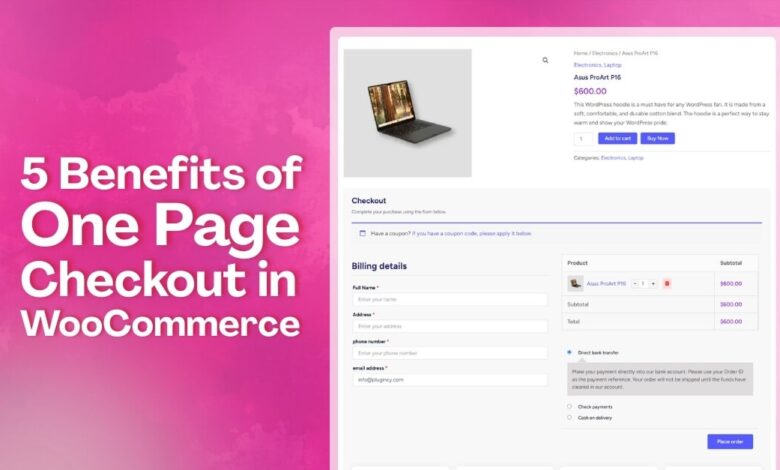
How Does One Page Checkout Work?
One page checkout is a simple online buying method that places all steps on a single screen. It loads the form fields, cart details, and payment parts together so people see everything they need in one place. The layout keeps each part in order, which helps the system collect details without making users move across many pages.
The system reads what users type right away and updates the same page as they move forward. Small groups of fields guide them from basic details to payment, while checks run in real time to confirm the information. Because everything happens on one screen, the checkout handles cart changes, updates, and payment choices smoothly without sending users anywhere else.
5 Benefits of One Page Checkout in WooCommerce
Buying online should feel easy from start to final click. One page checkout keeps every part in one clear place. You can see each step while the order takes shape. Continue reading to learn about the 5 benefits of one page checkout in WooCommerce that you might not expect.
Less Cart Abandonment
Many shoppers leave when the checkout feels long or confusing. A single page keeps them moving forward. Each part is easy to see. They can add or change details without fear. The cart stays updated while they type. That steady flow keeps people focused. More sales reach the finish.
Better Data Accuracy
The single page layout reduces typing mistakes. People see all fields at once. They can fix the wrong details before they pay. The system checks each field and shows small notes. This cuts failed orders from bad names or addresses. Support teams handle fewer issues after checkout is done.
Guest Checkout Made Easy
Many buyers prefer to skip account setup while shopping online. One page checkout lets them buy as guests without needing to sign up. Buying as a guest using One Page Checkout for WooCommerce keeps the process quick and clear. They only type the order details and continue with ease. No signup steps break the flow. The checkout stays short, simple, and focused on finishing the order.
Easy Order Changes
Sometimes shoppers want to adjust the size or count. One page checkout lets edits happen in place. The cart refreshes without sending people away. Users see the new total after each change. This simple loop reduces mistakes during checkout. Staff spend less time fixing wrong orders later on.
Live Stock Checks
The checkout page talks with the stock system. It shows if an item is still ready to ship. Out of stock items get flagged before payment. People pick another item without leaving the checkout. This prevents orders for products that are not there. Warehouses stay in sync with every order placed.
Why is Multi-Step Checkout Difficult for Users?
When checkout takes too long, many people experience stress. They do not like going through many screens for one order. Each step can feel slow and hard to follow. Read the points below to understand why multi-step checkout feels tough.
Too Many Screens
Users move across many pages and lose track of where they are. Each page asks for new details that break their focus. People often forget what they typed earlier and feel unsure. Slow loads make the steps feel even longer. Many leave because the process feels tiring.
Hard To Fix Mistakes
Fixing wrong details often sends users back to older pages. They look for the place where the error began. This adds time and breaks their flow. Some pages load slowly and make the fix harder. A simple slip can turn the whole task into extra work.
Confusing Steps
Some checkouts use long forms that feel messy. Users guess what comes next in the list. Parts look unclear and feel poorly linked. They jump between boxes and hope they fill them right. A confusing layout often makes simple tasks feel much harder.
Slow Loading Time
Each page loads one by one and takes extra time. Users wait and watch screens change again. This delay makes them worry about losing their progress. Slow sites push people to close the tab. It is hard to stay patient during long wait times.
No Clear Progress
Some checkouts do not show how many steps are left. Users feel stuck when they cannot see progress. They want a clear bar or count. Without it, the task feels longer than it is. Lack of clear signs makes people give up early.
Which Stores Benefit Most From One Page Checkout?
Many stores need a checkout that feels simple and fast. One page checkout works well for shops that want short steps. It keeps the buying flow clear and easy to follow. Discover which stores benefit most from it by reading the points below.
Digital Product Stores
These stores sell files, ebooks, music, or simple tools. Buyers get their items by download after paying. No shipping steps are needed here. A long checkout only slows the sale. Short forms fit this type well. People like clicking once and receiving fast. It keeps the process clear and calm.
Low-Priced Or Impulse Product Stores
Shoppers often grab small items without thinking long-term. They see a deal and add it fast. Extra screens can break that quick choice. Simple checkout keeps the moment alive. Fewer fields make the buy feel light. More sales happen when steps stay short. People finish before losing interest.
Subscription Or Service-Based Stores
These shops bill on a plan or repeat schedule. Users sign up once and get ongoing value. Long forms can scare people away. Short steps help them commit faster. They can pick a plan and pay. Clear pages also reduce billing mistakes later. Support teams then get fewer fix requests.
Mobile-First Stores
Most shoppers use phones while buying today. Small screens make long forms hard. Too many pages feel slow on data. Short checkout works better on small devices. Buttons stay large and clear. People move through steps with simple taps. There is less zooming or scrolling needed. The whole buy feels easier.
Flash Sale Stores
These shops sell deals for a short time. People rush to buy before the clock ends. Slow checkout can kill the sale. Short forms fit quick buying. Stock also changes fast during sales. A simple path helps orders clear faster. Fewer screens mean less chance of items selling out.
Popular One Page Checkout Plugins That WooCommerce Store Owners Can Use
Checkout should be quick and simple for customers, according to many stores. One page tools help cut steps, so people buy with less stress. These tools keep the whole flow clear on one screen. Here are some plugins that can help your store the most.
One Page Quick Checkout For WooCommerce
This plugin keeps checkout on one clear screen. It gives smooth steps with tools like popups, direct checkout, and fast forms. AJAX support helps users move without reloads. Extra layout choices and cart controls help shape a clean checkout page. The setup works well for stores that want fewer steps. This tool helps shops keep checkout light and fast.
CartFlows – Checkout And Funnel Builder
CartFlows helps guide buyers through clear steps on one screen. It offers strong templates and fields for checkout. Users can pick one page or steps based on their needs. Extra tools help add small offers during checkout. With these features, stores can shape a flow that feels simple and quick. The design helps buyers stay focused until payment.
PeachPay For WooCommerce
This tool gives shoppers a fast pop-up checkout. Users stay on the same page and pay with ease. It supports many payment methods that work in many places. Forms are easy to edit and type into. It also helps with safe checkout and global sales. Simple steps make it a good fit for many shops.
Fluid Checkout For WooCommerce – Lite
Fluid Checkout For WooCommerce gives stores a smooth one page flow. Forms show clear notes while users type. Trust icons can appear on checkout or thank you pages. It also supports fast pay buttons and simple field control. Extra layout settings help stores shape a clean screen. A simple view helps the whole process feel easy to follow.
Barn2 – WooCommerce Fast Cart
This plugin joins cart and checkout in one popup. Users see their items and pay without moving to new pages. The cart can float or open in a centered box. Shoppers can change items while staying in the popup. It works with many payment tools and themes. A tight layout helps people finish orders faster.
Tips for Picking a One Page Checkout Plugin for Your Store
Picking a good one page checkout plugin can feel a bit tricky. Some tools work great, while others may slow things down. The right choice depends on your store and what buyers need. Here are some tips to help you choose the right one.
- Check If It Matches Your Store Type: Every store sells differently, so the checkout flow should match how customers buy. Digital products, services, and physical items all need different steps. A plugin that fits your store type keeps checkout clear and avoids confusion.
- Look For Mobile Friendly Design: Many customers shop using their phones, so mobile usability is critical. The checkout should load fast, fit small screens, and use easy taps. Clean layouts and short forms help mobile buyers finish without frustration.
- Check Payment Options: Buyers prefer having choices when paying. A good plugin should support cards, PayPal, wallets, and local methods. More payment options remove hesitation and give customers confidence to complete their purchase smoothly.
- Look For Easy Form Controls: Checkout forms should be simple and adjustable. The plugin must allow removing or rearranging fields so only useful details appear. Fewer fields reduce effort and help customers complete checkout faster.
- See If It Offers Fast Checkout Tools: Features like popup checkout, direct buy buttons, or one-click purchase can speed things up. These tools are helpful for repeat customers and low-priced items, making checkout feel quicker and less demanding.
- Test How It Works Before Going Live: Always test the checkout like a real buyer before launch. Place test orders, use coupons, and check payments. Testing early helps catch errors and ensures customers experience a smooth checkout process.
- Check Support And Updates: Strong support and regular updates matter for long-term stability. Look for active development and recent updates. Responsive support helps resolve issues quickly and keeps your checkout working with new WooCommerce versions.
Conclusion
Fast checkouts are no longer a nice-to-have, they’re a must. People want quick steps, less waiting, and zero confusion. A smooth buying flow keeps them happy and more likely to return.
When you look at the 5 benefits of One Page Checkout in WooCommerce, it’s clear how much easier it makes things. From faster edits to guest checkout, every part feels light and simple. Buyers don’t get stuck, and stores don’t lose sales.
Now’s the time to rethink your checkout process and keep things easy. Whether you sell digital goods or physical items, the right setup matters. Test it on your store and watch how it improves the full buying flow. Simple checkouts lead to more happy customers.